
A destructive action permanently changes or removes data. These include actions such as closing an account, deleting a saved credit card, wiping a profile, and canceling a subscription that cannot be reinstated. These are the moments where an accessibility defect stops being an inconvenience and becomes a loss the user cannot recover from.
A mislabeled button on a marketing page wastes a few seconds.
A mislabeled button on a delete confirmation may wipe out something the user needs and doesn’t realize they’re about to lose.
Destructive flows deserve stricter review than the rest of the product. The cost of getting them wrong is higher, and the users most likely to be harmed are those the product already serves least well. Here are the rules worth implementing.
Warn in plain language, before the action
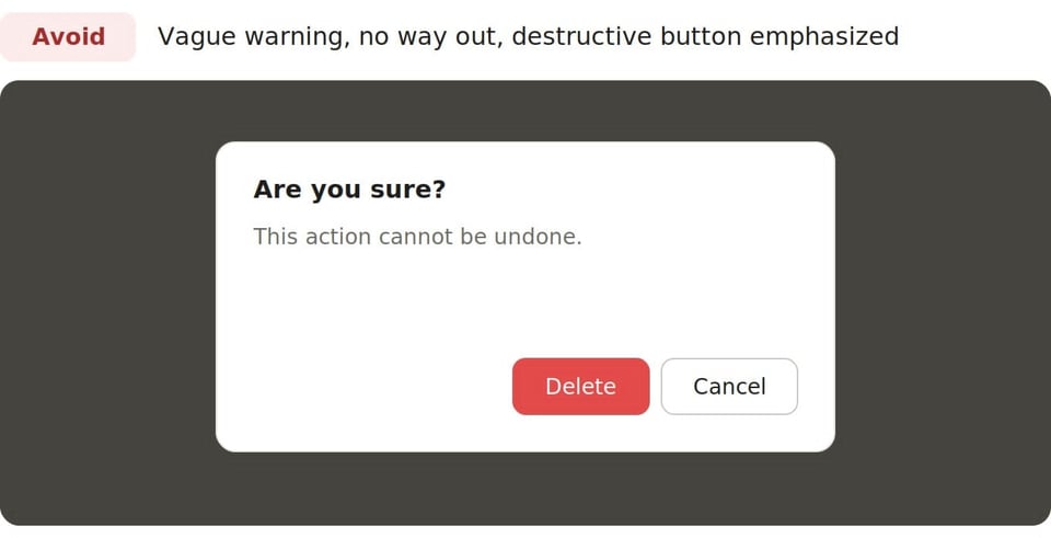
The warning has to say what will happen, in words a person can understand on the first read. Not “this action cannot be undone,” floating alone with no object. The text is a double negative, and using “this” without an object makes it hard for people to determine which object is being acted on. Text like “Pressing the continue button will permanently delete your account and all of your saved files. You will not be able to get them back,” is much more specific because it names the thing being destroyed, how it is being destroyed, and the consequence of the destruction.
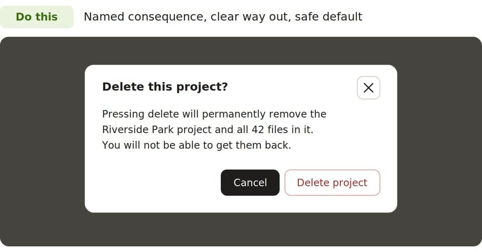
Plain language is not a nicety here. A person using a screen reader hears the warning linearly, once, with no visual cues to rely on. A person with a cognitive disability, or anyone under stress, needs the meaning to land without extensive decoding. Legalese, vague pronouns, and hedged phrasing all increase the risk that someone confirms an action they do not understand. Write the warning at a reading level that works for everyone, lead with the consequence, and place it before the point of no return, not on a receipt after the fact.
Pay attention to dialog focus management
When a confirmation dialog appears, focus must move into it. If focus stays behind on the page, a screen reader user may not know the dialog exists, and a keyboard user has to hunt for it. Modals are a good choice here. Move focus to the dialog when it opens, trap it while it is open so tabbing cannot wander back to the disabled page behind it, and ensure the dialog is announced with an accessible name and role so assistive technology presents it as the interruption it is.
Where focus lands inside the dialog matters too. Sending it to the heading or the descriptive text lets the person hear the warning before they reach the controls. Dropping focus directly onto the confirm button invites accidental activation by someone who pressed Enter out of habit. Lead them through the message first, then the choice.
Decide deliberately where the focus goes after the action
The moment a confirmation dialog closes is one of the most commonly broken points in the entire flow. The dialog and often the element that opened it are now gone, so focus has nowhere obvious to return to. Left to the browser’s default, focus falls back to the top of the document, leaving the user with no signal that anything happened and no sense of where they are.
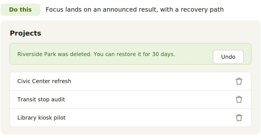
Handle both outcomes purposefully. When the user cancels, return focus to the control that opened the dialog so they land exactly where they left off. When the user confirms, and the triggering control no longer exists because the item was deleted, move focus to a stable, logical landing spot: a status message confirming what happened, the heading of the list the item was removed from, or the next actionable element. Pair that with a clear, programmatically announced confirmation of the result so the person knows the action succeeded and understands where they are now.
Place buttons consistently, with the safe choice as the default
Destructive dialogs are where inconsistent button placement can do some real damage. If Cancel is on the left in one dialog and on the right in the next, a person who has learned the pattern in one place is punished by their muscle memory in another. Pick an order, document it, and stick to it across every destructive flow in the product. Consistency lets people act confidently instead of re-reading every line of dialogue from scratch.
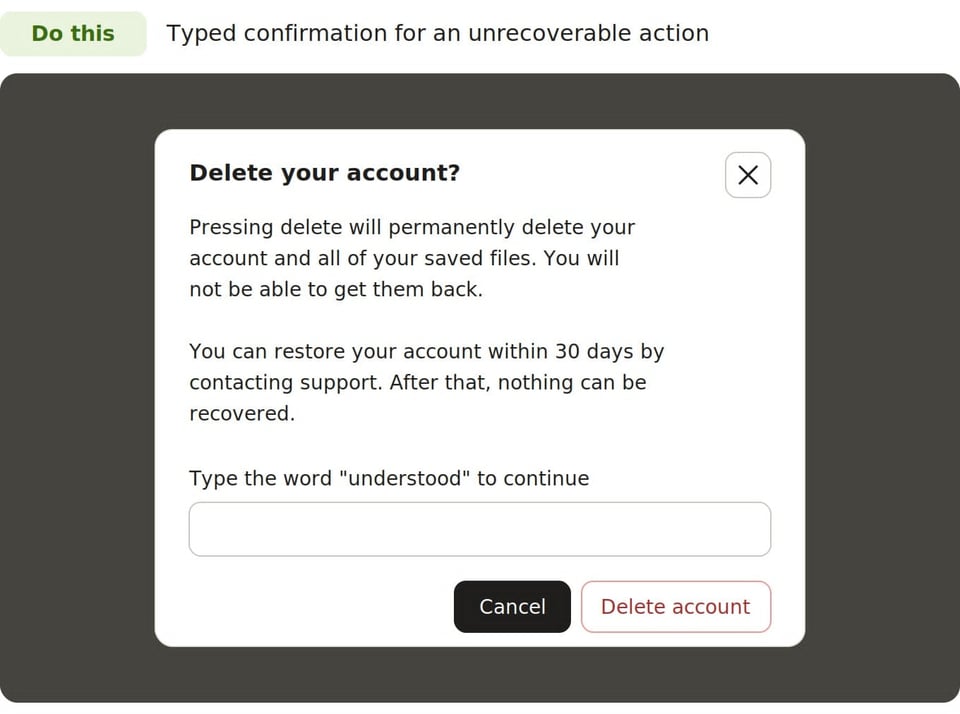
Just as important, the default action, the one that fires on Enter or receives initial emphasis, should be the safe one. In a delete confirmation, the default is Cancel, not Delete. A person who reflexively confirms should be protected, not have destruction inflicted on them. The destructive control still needs to be reachable and clearly labeled, but it should never be the path of least resistance. Reserve the easy, automatic action for the choice that does no harm. For super-destructive actions, requiring the user to type a word like “understood” instead of just clicking a button forces them to take a beat and truly consider the ramifications of their action.
Give an escape and a recovery path
Every destructive dialog needs an obvious, no-cost way out. The Escape key should dismiss it, a visible Cancel control should be present, and dismissing it must never trigger the destructive action. Beyond the dialog itself, resilience means offering recovery where possible: a grace period before permanent deletion, a way to restore a closed account within a window, or, at a minimum, a clear statement of what is and is not recoverable so the person can make an informed choice.
How to test these flows
These flows are low in traffic and high in consequence, which is exactly why they get skipped in testing and also exactly why they should not be skipped. The user who reaches a delete confirmation has already decided to do something serious. The least the product can do is make sure they understand it, can back out of it, and are not tipped into it by a poorly built dialog.
Test destructive actions with the same rigor you would apply to a payment flow, because the stakes are comparable.
- Run each flow using only the keyboard, confirming that focus enters the dialog, stays trapped inside it, and lands somewhere sensible after both cancel and confirm.
- Check that the plain-language warning names both the object and the consequence.
- Confirm that the button order matches every other destructive dialog in the product and that the safe choice is the default.
- Try to dismiss the dialog in every way you can and verify that none of those paths destroys anything.
- Run each test with all forms of assistive technology you are testing on all browsers and operating system combinations.
- Verify that the warning, the controls, and the final result are all announced.
One logistical problem with destructive testing is unavoidable: it’s a one-time deal that consumes the data it acts on. Once the test account is closed or the saved card is deleted, that data is lost, and the next test needs it back. Plan the reset before you start, not after you have wiped something you cannot rebuild. Count how many instances of what kind of data you need for your test cases, and get them all set up at once. Add a few in to allow for some buffer.
Another approach is a dedicated test environment with seed data that can be restored on demand. A script or fixture that provisions a fresh account, populates it with saved payment methods, files, and settings, and can be rerun between test passes turns a one-shot destructive test into something reasonably repeatable with minimal effort. This can be done by automating UI interactions using Selenium or by running an SQL script to reload the tables. When a full environment is unavailable, at least maintain a documented setup checklist so a tester can consistently recreate the required state each time. Never run destructive tests against production or shared accounts, where the loss is real. Budget re-creation time into the test plan, because destructive flow data recreation takes time.