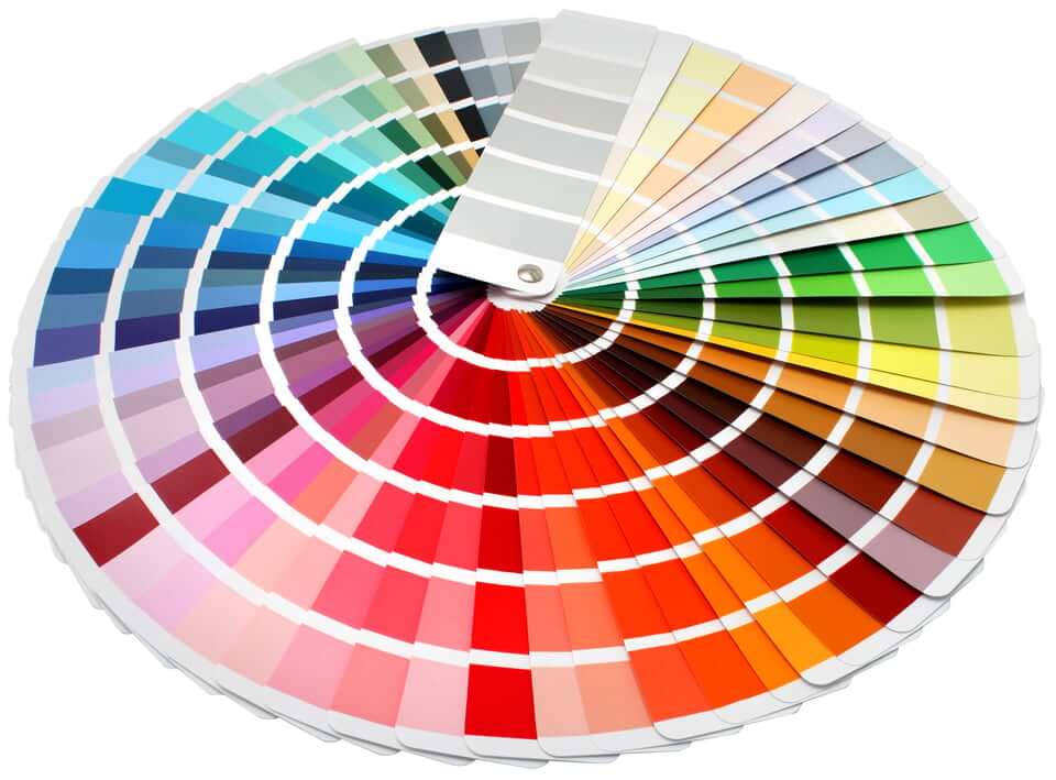
Most accessibility conversations about color stop at the contrast ratio between a foreground color and its background. That number is easy to determine, which is why automated tools report it and why procurement language asks for it. Contrast ratios calculate relative luminance (brightness) and carry no information about hue, saturation, pattern, cultural meaning, sensory load, or whether a person can look at a screen for thirty seconds without getting sick. A palette can pass every WCAG contrast check and still be unusable for large groups of people.
This article covers the color requirements that WCAG actually contains, followed by the color decisions that affect users and that no conformance requirement addresses.
Color Requirements in WCAG
Under WCAG 2.2, the standard adopted by Section 508, EN 301 549, and the Department of Justice Title II web and mobile rule at 28 CFR Part 35, color is addressed by four success criteria.
1.4.1 Use of Color. Color cannot be the only visual means of conveying information, indicating an action, or distinguishing a visual element. See Understanding Use of Color.
1.4.3 Contrast (Minimum). A 4.5:1 luminance ratio between text and its background, reduced to 3:1 for large text. See Understanding Contrast (Minimum).
1.4.11 Non-text Contrast. A 3:1 ratio for user interface component boundaries and for graphics required to understand content. See Understanding Non-text Contrast.
2.3.1 Three Flashes or Below Threshold. General flash and red flash thresholds for content that flashes more than three times in one second. See Understanding Three Flashes or Below Threshold.
Those four criteria are the entire WCAG 2.2 Level AA regulated surface for color. If your goal is compliance, then you are done. That is the primary point where every accessibility specialist SHOULD BE telling their clients “WCAG is a floor.” There are so many things beyond these four criteria that impact people with disabilities. Everything else in this article tells you what you need to know to do a GOOD job with color choices, and not just a compliant job.
Color Issue 1: Color Vision Deficiency (aka Color Blindness)
Roughly one in twelve men and one in two hundred women have some form of color vision deficiency, according to the National Eye Institute. Most of those people see some color but compress parts of the spectrum rather than losing them outright. If your audience is 80% male, that means 6.5% of your audience is color vision deficient.
TL;DR: Having a great contrast ratio does not mean your colors can be perceived by someone who is color vision deficient.
Where this shows up
Status systems. Red, amber, and green indicators that each pass contrast individually and collapse into the same muddy tone for a person with deuteranomaly.
Charts with categorical series. Six line colors in a legend that a user has to match by hue to six lines on a plot.
Choropleth maps. Sequential red-to-green scales, which are the most common inaccessible palette in open data portals.
Success Criterion 1.4.1 is regularly satisfied on paper by adding a legend, a tooltip, or a hover state. A legend still requires the user to match a swatch to a region by hue. A tooltip that appears on mouse hover is unavailable to keyboard users and touch users. Conformance with 1.4.1 does not ensure everyone can access the information.
Recommendations
Vary lightness as well as hue. If two data series differ by 30 percent in lightness, they stay distinguishable when hue information is lost.
Cap the number of categories. No categorical palette stays distinguishable past about six or seven values for anyone, and past about four for many people with color vision deficiency.
Allow users to choose their colors. If they want chartreuse next to blue because that color pattern works for them, let them. Don’t let your desire for modern, simplistic design interfere with what users need to use your software.
Color Issue 2: Neon, Saturation, and Autistic Sensory Processing
Autistic people frequently report that highly saturated and fluorescent colors literally cause them pain. Research on color preference in autistic children has found significantly lower preference for yellow, the highest luminance hue tested, alongside higher preference for muted greens and browns, with sensory hypersensitivity offered as the explanation. More recent research found that participants with high sensory sensitivity consistently preferred soft, low-saturation colors and associated them with reduced sensory overload
Neon and fluorescent colors are designed to appear brighter than the surface they sit on. On a display, this means near-maximum saturation at high luminance across a large area of the visual field, sustained for as long as the page remains open. No WCAG success criterion addresses saturation. A neon lime background with black text has a contrast ratio above 15:1 and easily passes the WCAG contrast requirements. Autistic individuals may move on because they just can’t look at it. In fact, this is where the inspiration for this article came from: someone on LinkedIn recommended magenta on black based on contrast alone, and I couldn’t even look at the image for 10 seconds.
Design patterns that cause problems
Full-bleed saturated backgrounds. Hero sections, alert banners, and marketing pages using saturated brand color across the entire viewport, especially if that color is neon (Mattel, I’m looking directly at you here).
Saturated color used as decoration. Color chosen to make a page look energetic carries no information, so it adds sensory load with no corresponding benefit to the user.
Animated gradients and color cycling. Slow hue rotation in a background falls outside flash thresholds and animation criteria.
Large-area color change on interaction. Hover and focus states that repaint an entire card or table row in a saturated tone.
Recommendations: Reserve high saturation for small elements that need attention, keep large surfaces low in chroma, and honor the prefers-reduced-motion media query for anything that animates color.
Color Issue 3: Color Choices That Trigger Migraine
Photophobia accompanies more than 80 percent of migraine attacks. Research found that a narrow band of green light near 520 nanometers, at low intensity, aggravates migraine significantly less than white, blue, amber, or red light, and that blue and red light selectively worsen both pain and associated anxiety. Hue, separate from luminance, has a measurable physiological effect on a very large population.
Migraine is also triggered by pattern. High-contrast repeating stripes produce visual stress and perceptual distortion in most people and headache in people with migraine. On the web, that appears as tightly striped table rows with strong alternation, pinstripe and hatch background textures, dense pattern fills in charts, repeating CSS linear gradients, and closely spaced high-contrast rules. The disability pride month flag was changed because the original version was triggering migraines.
Contrast requirements introduce a second problem. WCAG sets a minimum ratio and no maximum. Designers told to maximize contrast move toward pure black on pure white, which, for a photophobic user at high display brightness, worsens the symptoms for people who are sensitive, including people with dyslexia. Meeting the contrast minimum and producing something a user with a migraine or dyslexia can tolerate are separate objectives, and WCAG measures only the first.
Color Issue 4: Static Patterns and Seizures
WCAG Success Criterion 2.3.1 covers flashing content. Nothing may flash more than three times in any one second unless it stays below the general flash and red flash thresholds. Two aspects of that criterion are widely misunderstood.
Saturated red is a separate hazard: The red flash threshold exists because transitions to or from saturated red carry seizure risk independent of luminance change. A red flash can be hazardous at a luminance differential that would be safe for any other hue. Most manual test protocols check flash rate and skip the red condition entirely.
Static patterns are a trigger and are ignored: The Epilepsy Foundation of America expert consensus defines a potentially provocative pattern as one containing clearly discernible stripes, more than five light and dark pairs in any orientation. Sensitivity peaks between one and ten cycles per degree of visual angle. Nothing in WCAG 2.3.1 addresses static patterns, because a static pattern does not technically “flash.” A striped background that becomes a moving pattern when the user scrolls, or a parallax layer that shifts against a fixed grid, converts a borderline static risk into an active one. This is commonly called “pseudoflashing.” For a detailed treatment of the gaps between the various international standards, see the ACM Transactions on Accessible Computing gap analysis on photosensitive epilepsy guidelines and the MDN guidance on seizures and physical reactions.
Automated flash analyzers evaluate video files. They do not evaluate a repeating gradient in a stylesheet, an animated SVG, a loading spinner with high contrast spokes, optical illusions, stereograms, or a data table with aggressive zebra striping.
Color Issue 5: Offering Only Dark Mode or Only Light Mode
Shipping a single theme is an accessibility failure (though not a WCAG failure) regardless of which theme it is, because the populations that need each one do not overlap.
Who prefers dark themes: People with photophobia from migraine, traumatic brain injury, post-concussive syndrome, iritis, dry eye disease, albinism, and achromatopsia. People with light sensitivity from medication. People working in low ambient light. Some autistic users who find large bright surfaces overloading.
Who prefers light themes: People with astigmatism or glaucoma, who experience halation (the apparent bleed or glow of light text against a dark field). Many people with dyslexia, for whom total contrast in either polarity is harder to read. Older adults, whose pupils dilate less and who generally read better with positive polarity.
Common implementation failures
Pure white on pure black. Maximum luminance differential produces the worst halation and the harshest reading experience. People with dyslexia are particularly impacted by this. Use an off-white foreground on a very dark neutral rather than absolute values.
Not compensating font weight. Light text on a dark field appears heavier than the same weight on a light field. A weight that reads cleanly in light mode can smear in dark mode.
Locking the theme to the operating system. The prefers-color-scheme media query should set the default, not the ceiling. A user may reasonably want the system in dark mode and one long-form reading site in light mode, and needs an in-page control to do it.
Incomplete themes. Focus indicators, form validation states, charts, embedded PDFs, iframes, images with baked-in white backgrounds, syntax highlighting, and email templates are the components that routinely get left behind when a dark theme is added late in the release cycle
Ignoring the other preference queries. prefers-contrast and forced-colors carry real user intent. Windows Contrast Themes replace an author palette wholesale, and anything that carries meaning through a background image, a CSS gradient, or a box shadow disappears when they are active.
No success criterion requires an author to ship two themes, to respect a preference query, or to provide an in-page control.
Other Color Issues No Standard Regulates
Age-related lens yellowing. The crystalline lens absorbs progressively more short-wavelength light with age. Discrimination in the blue and violet range degrades, so navy against black and pale blue against white become difficult for older users. Hue discrimination sits outside the scope of the contrast requirements.
Cultural color meaning. Red signals loss in United States equity markets and gain in Chinese markets. Green means proceed in one context and toxicity or hazard in another. White is a mourning color across much of Asia. A status palette that reads as intuitive to a domestic audience becomes something an international user has to memorize, which adds cognitive load for everyone and more of it for users with cognitive disabilities.
Color vibration. Saturated red type on a saturated blue field appears to shimmer or float at a different depth, because the eye focuses long and short wavelengths at slightly different planes. That pair passes every contrast check in the standard, but can cause sensitive issues real perception issues.
Exempted interface states. Contrast requirements exempt inactive and disabled components, logotypes, and incidental text. That exemption is why grayed-out menu items, disabled buttons, and placeholder text are frequently illegible. A user who cannot read a disabled control cannot tell whether the feature exists, whether it is temporarily unavailable, or whether they are making a mistake.
Focus indicator color against variable backgrounds. WCAG 2.2 added Focus Not Obscured, which addresses whether other content covers the indicator. No criterion requires that a focus color be visible against every background it can land on. A single brand-blue outline that works on a white page vanishes over a blue hero image or a photographic card. TL;DR: It’s really hard to make sticky headers accessible, because this happens a lot, especially when using magnification
Link color without underlines. Removing underlines is permitted if link text has a 3:1 ratio against surrounding body text and a non-color cue appears on hover and focus. Many design systems meet that requirement and still produce links that a substantial share of readers scroll past without seeing unless the link is underlined to make it stand out.
Grayscale and print output. Documents and dashboards designed in full color get printed on office laser printers in monochrome, and multi-series charts collapse. Public entities regularly publish an accessible color chart online and hand out a monochrome version of it at the meeting where the data is discussed.
Rendering variation across devices. Uncalibrated monitors, blue light filters, night shift modes, e-ink readers, projectors, and the difference between OLED and LCD all shift what the user sees. A ratio measured in a design tool is an estimate of what reaches the eye.
Visual stress and tint preference. Some readers, including many with dyslexia and Irlen syndrome, read better with a background tinted cream, pale blue, or pale gray. Hard-coded backgrounds and text baked into images defeat the browser extensions and system color filters that would otherwise deliver that.
Brand palettes locked before accessibility review. The most expensive color problem in most organizations is a brand guide approved years before anyone tested it, with a primary color that cannot reach 4.5:1 against either white or black. Every product team downstream then builds workarounds around a color they have no authority to change.
Practical Recommendations
Test functional colors against each other. Check every meaningful color against every other color it can appear beside, including chart series against each other and status colors against each other, rather than only against the background.
Ship both themes and respect user preferences. Provide light and dark, use prefers-color-scheme as a default rather than a lock, expose an in-page toggle, and honor prefers-contrast, forced-colors, and prefers-reduced-motion.
Keep meaning out of hue, and check the redundant cue. Verify that the second channel is reachable by keyboard, exposed to assistive technology, and present in printed output.
Keep large surfaces low in chroma. Reserve high saturation for elements small enough that a sensitive user can look away.
Audit for repeating high contrast patterns. Search stylesheets for repeating gradients, hatch and stripe textures, and zebra striping with strong alternation, then soften or remove them.
Include people with these conditions in testing. Simulators reasonably approximate dichromacy. They approximate anomalous trichromacy poorly, and they give no information about migraine, sensory load, or visual stress.
Write the constraints into the design system and the contract. Procurement language that lists a contrast ratio as its only color requirement gives a vendor no obligation to address anything else in this article.
For further reading on user needs that sit outside the current success criteria, the W3C has published Accessibility Requirements for People with Low Vision and Making Content Usable for People with Cognitive and Learning Disabilities. Both describe user needs that a fully conforming product can fail to meet. Contrast is a color property that is easy to measure and easy to write into a contract, and it explains how much of the conversation it occupies. It represents a small fraction of the color decisions that determine whether a given person can use a product.