When a website links to content it does not own or control, it is easy for assistive technology users to miss that they’ve ended up on a different domain that likely has different accessibility, privacy, and security controls than the initial one. Even when a website owns the content, for example, a downloadable PDF, it remains important to inform the user what is going on to give them enough information to decide whether or not to proceed.
This article examines the accessibility risks introduced at these transition points and proposes a concrete pattern that I call a “speed bump modal” for sites that link to content beyond their own control.
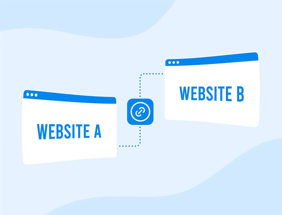
Why Off-Site Navigation Is an Accessibility Problem
A well-maintained website can invest significant effort in ensuring its own content meets accessibility standards: proper heading structure, colour contrast, keyboard navigability, screen reader compatibility, and so on. But the moment a user follows a link off that site, all of those guarantees disappear. The destination might be a site with halfway decent code, or it might be a third-party vendor whose site has never been audited for accessibility (or for security or privacy, for that matter). The fact that a company partners with someone who doesn’t share its accessibility values diminishes the first company’s reputation.
The problem is compounded by the fact that not all users immediately realise they have left the original site. There is no boundary, warning, or moment of pause. Navigation happens instantly, and the user suddenly finds themselves in an environment that may not work with their assistive technology, may not load on a slow connection, or may not even be secure. The user may have to select “don’t sell my data” again to maintain privacy on the second site.
Your accessibility standards, privacy policy, and security standards do not apply on the other side of that link. Make sure your users understand that transition is happening.
Silence is a lazy and potentially dangerous choice
The most common approach today is to do nothing. Some sites add a small external-link icon next to outgoing links, but this is a purely visual cue that conveys nothing to screen reader users (without good alt-text) and also nothing about privacy, security, or accessibility on the destination site. The W3C’s WCAG guidelines (technique G200) recommend that when links open new windows or tabs, users should be warned in advance. WCAG is a floor. You can, and more importantly SHOULD do better on something this serious.
The Accessibility Speed Bump Modal
When a website links to a destination it does not own or control, it should present a modal dialog to the user before completing the navigation. This is a moment of informed consent before the user leaves the site’s trust boundary.
What the Modal Should Communicate
The modal should be brief and to the point. It should convey four things:
- Accessibility: The destination site may not meet the same accessibility standards as this site.
- Security: This site does not control the security or content of the destination.
- Privacy: You are leaving the original site. The destination has its own privacy policy and may collect information differently.
- Liability: The company that owns the host site is absolutely not liable for anything that happens on the destination site.
If your organization is big enough to have a lawyer, you may want to consult with them for the exact messaging. (reminder – I am not your lawyer, and cannot be relied on for legal advice), However, if you just want to look at a couple of companies that have done a decent job of this and probably had lawyers look at it, check out MacDonalds.com and NavyFederal.org
What the Modal Should Offer
The user should be given two clear options:
- Continue to the external site (with the destination clearly named).
- Stay on the current site (dismiss the modal).
The default should be on the stay option. By requiring users to select the continue button, you are preventing them from making an uninformed error.
Having the standard Close X at the top right is also a good idea.
Making the Modal Itself Accessible
The modal is an accessibility feature. It must not itself be an accessibility barrier. Implementation should follow the W3C WAI-ARIA modal dialog pattern:
- Use role=”dialog” and aria-modal=”true” on the modal container.
- Set aria-labelledby to reference the modal’s heading, and aria-describedby to reference the body text.
- Move keyboard focus into the modal when it opens. Trap focus within it using Tab and Shift+Tab cycling.
- Allow the modal to be dismissed with the Escape key.
- Return focus to the original link when the modal is closed.
- Mark background content as inert so screen readers do not navigate into it while the modal is open.
Downloads: The Invisible Context Switch
Downloads are among the most common and least well-managed forms of off-site navigation. When a user clicks a link expecting a web page but instead triggers a file download or a browser plugin, such as a PDF viewer, it can be a jarring, unannounced context switch. Depending on the user’s system, they may not have the software, storage, or network bandwidth to handle a file they didn’t realize they had requested.
Downloadable files
Most of the time, when a user clicks a link, they expect the content to update or for a new page or window to open. That’s not what happens on a download. The format of a downloadable file has direct accessibility implications. Failing to communicate the file type before a user downloads it is a preventable barrier. Not every file type is equally navigable by assistive technologies, and not every user has the software to open every format. Also, users might miss the small graphic indicating that a download occurred, leading them to think they didn’t activate the link and then activate it again, filling up their storage with useless files.
Example of good download link text:
Download 2024 Annual Report (PDF opens in new tab, 3.2 MB)
Example of bad download link text:Annual ReportWhen content can be delivered as a web page, it should be. HTML is the most accessible format available: it is rendered natively by browsers, works with screen readers without additional software, supports responsive layout, and can be styled for high contrast. When a document can be presented as HTML, that should be the preferred option.
PDF: Accessible Only If Made So
PDF is the most common download format on the web, but PDF files are not always accessible. A PDF must be deliberately tagged and structured. The PDF file creator must, at a minimum, consider reading order, alt text for images, proper heading hierarchy, the need for a table of contents, and language metadata. Scanned PDFs or those exported from a tool without accessibility features may be entirely unusable by assistive technology. Users should always be told they are about to download a PDF, how big it is, and where possible, an HTML alternative should also be offered.
Microsoft Office Formats: Context-Dependent
Formats such as .docx, .xlsx, and .pptx can be made accessible within their native applications, and modern versions of Microsoft Office include accessibility checkers. However, these formats require specific software that must be purchased. Furthermore, their accessibility depends entirely on how the original document author created them. When these formats are offered for download, the file type must be clearly stated.
File Sizes: Bandwidth Is Not Universal
A 50 MB file download is not terribly remarkable on a fast desktop connection. On a mobile device with a metered data plan, or on a slow rural connection, however, it is a serious barrier. File size is an accessibility concern, not just a performance one.
Best practices for communicating file size include:
- Always include the file size in the link text, not in a tooltip or adjacent text. This makes it available to both sighted and non-sighted users
- Use standard abbreviations for file sizes (KB, GB) with correct capitalization.
- If the file size is not known in advance (e.g., dynamically generated reports), state an approximate or maximum size.
Final Thoughts
Accessibility does not stop at the edge of a domain. Every time a website redirects a user to another page or triggers a download, it makes a statement about how much the organization cares about its users’ experience. Do they comply and stop there? Or do they make sure users understand the implications of what they are doing BEFORE they press a button or press Return?
The technology to do this correctly exists and is not difficult to implement. Why not make it a better experience while avoiding potential liability? Accessible modal dialogs and robust link text are well documented, well supported, and straightforward to implement.
No, they are not required under WCAG
Yes, your users will thank you for them.